
Hulu is the first major streaming platform to offer a social watching experience. And with most major league sports now being allowed to resume behind closed doors, Hulu’s combined proposition with ESPN will likely help entertain the service’s 30+ million users over the winter months.
But users have a surplus in choice of streaming services right now, so how will Hulu stay competitive?
With the help of UX expert Peter Ramsey from Built for Mars, we’re going to give Hulu an Extra Crunch UX teardown, demonstrating five ways it could improve its overall user experience. These include easy product comparisons, consistent widths, proportionate progress bars and other suggestions.
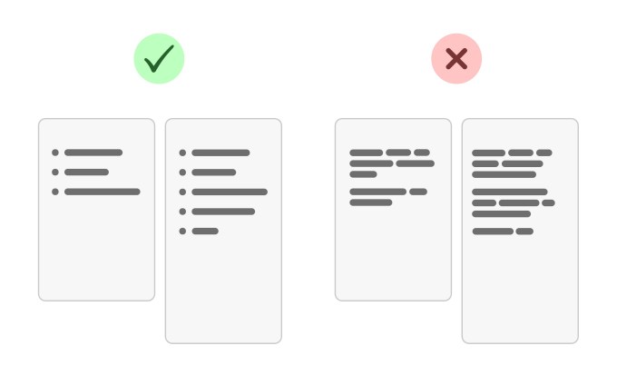
Comparing features inside packages
If your product/service has different tiers/versions, ensure that the differences between these options are obvious and easy to compare.
The fail: Hulu has four different packages, but the listed features are inconsistent between options, making it incredibly difficult to compare. Instead of using bullet points, they’ve buried the benefits within paragraphs.
The fix: Break the paragraphs down into bullet points. Then, make sure that the bullet points are worded consistently between options.
Steve O’Hear: I’m really surprised this one got past the marketing department. Not a lot to say except that I would argue that when UX, including layout and copywriting decisions, become decoupled from business goals and customer wants, a company is in trouble. Would you agree that’s what has happened here?
Peter Ramsey: Honestly, this happens all the time. I think it’s just a symptom of the designers building things that look nice, not things that work nicely. I probably raise this issue on about one-third of the private audits I do — it’s that common.
Keep a consistent width
Try to maintain a consistent page width throughout a single journey — unless there’s a major benefit to changing the width.
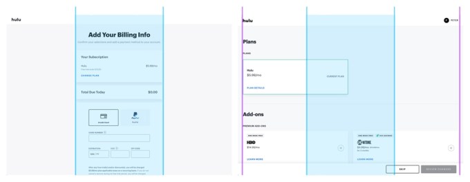
The fail: During the Hulu sign-up process, the page width doubles at a totally unnecessary point. This is disorienting for the user, with no obvious rationale.
The fix: Hulu has a pretty consistent first-half of their journey and then it drops the ball. I’d redesign these “extra-wide” pages to be the default width.
Read the original post: Hulu UX teardown: 5 user experience fails and how to fix them
Organize your team with Milanote.
Enjoy relaxed ambient music byTPV Media.